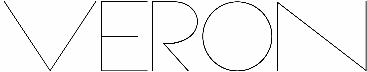
Veron
The font Veron has three heigh...
The font Veron has three heights: Normal, Bold and Bold Extra: a decorative alternate.
The Veron font is perfect to write titles, names and make posters. The Normal and Bold heights have some alternate characters in the lowercase. The three fonts are kerned. This is the second and last update of the Veron font, I adjusted all glyphs metrics and heights because they were looking weird in some designs.
License: These fonts were designed by Paulo R. They're free for personal and commercial use, just keep them MINE. Enjoy!
Follow me on Twitter: twitter.com/skomii .
www.skomii.com
Paulo R, 2013 .
More
Designed by:
skomii
Category:
Sans serif
File size:
1731.51 kb
Favorite:
Add to favorites
Rate this font: